Espisi
An end to end brand strategy for Espisi
How it was:
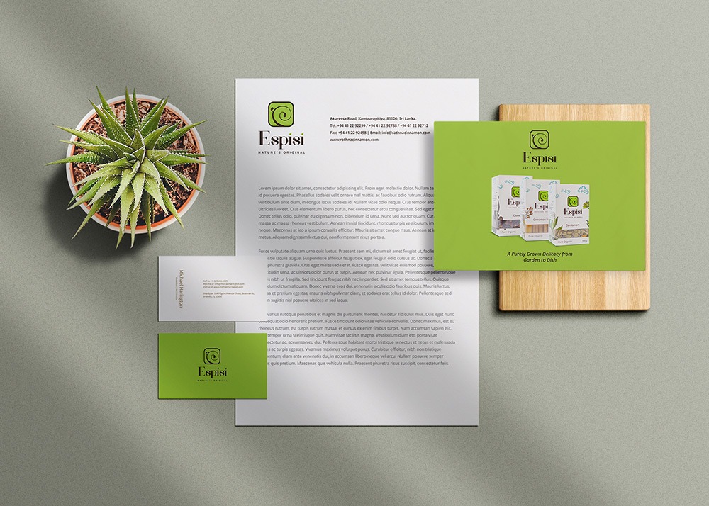
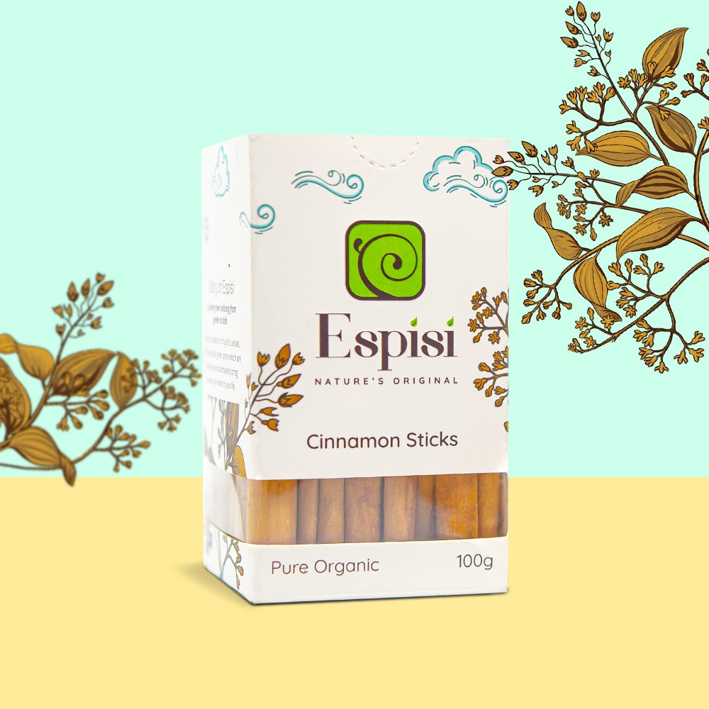
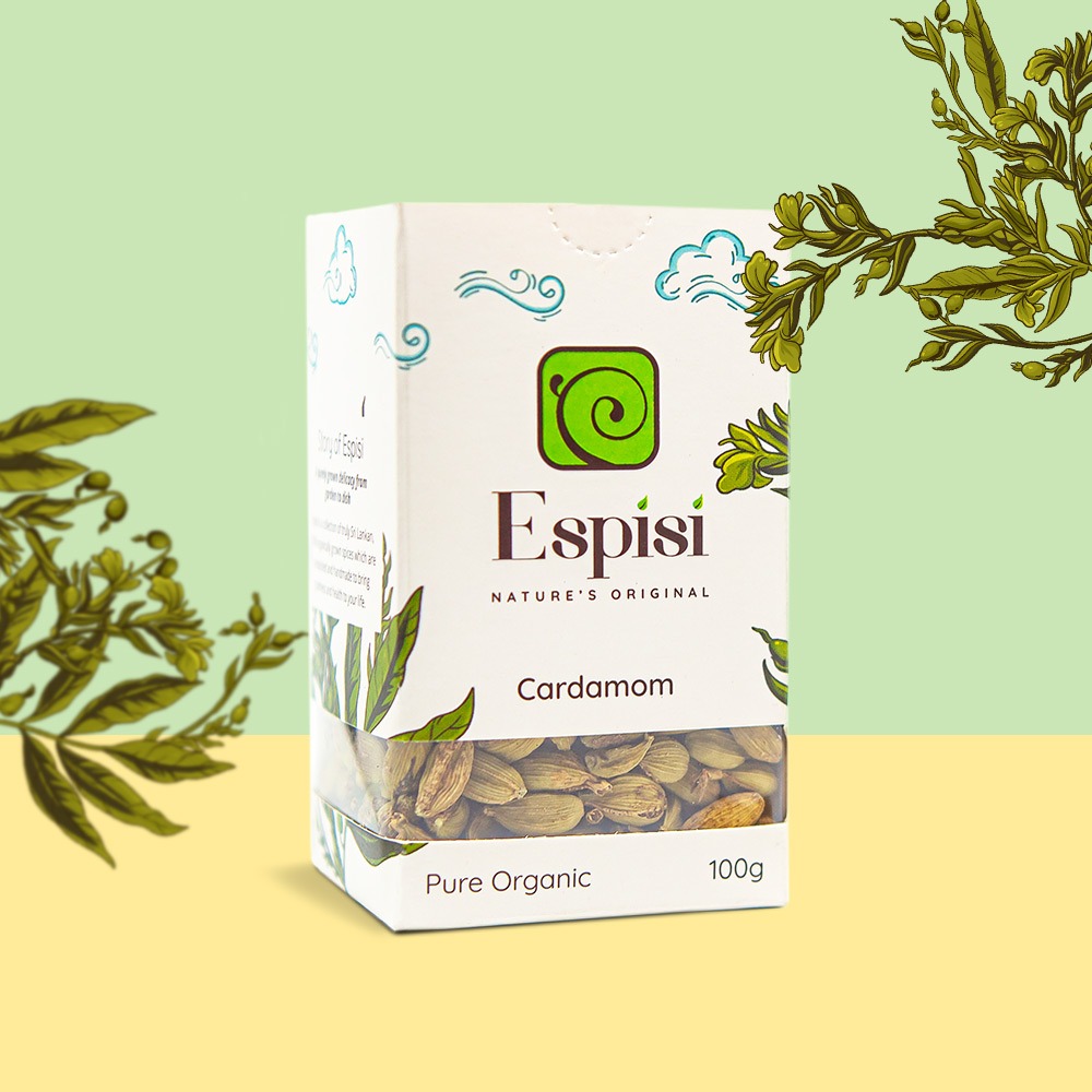
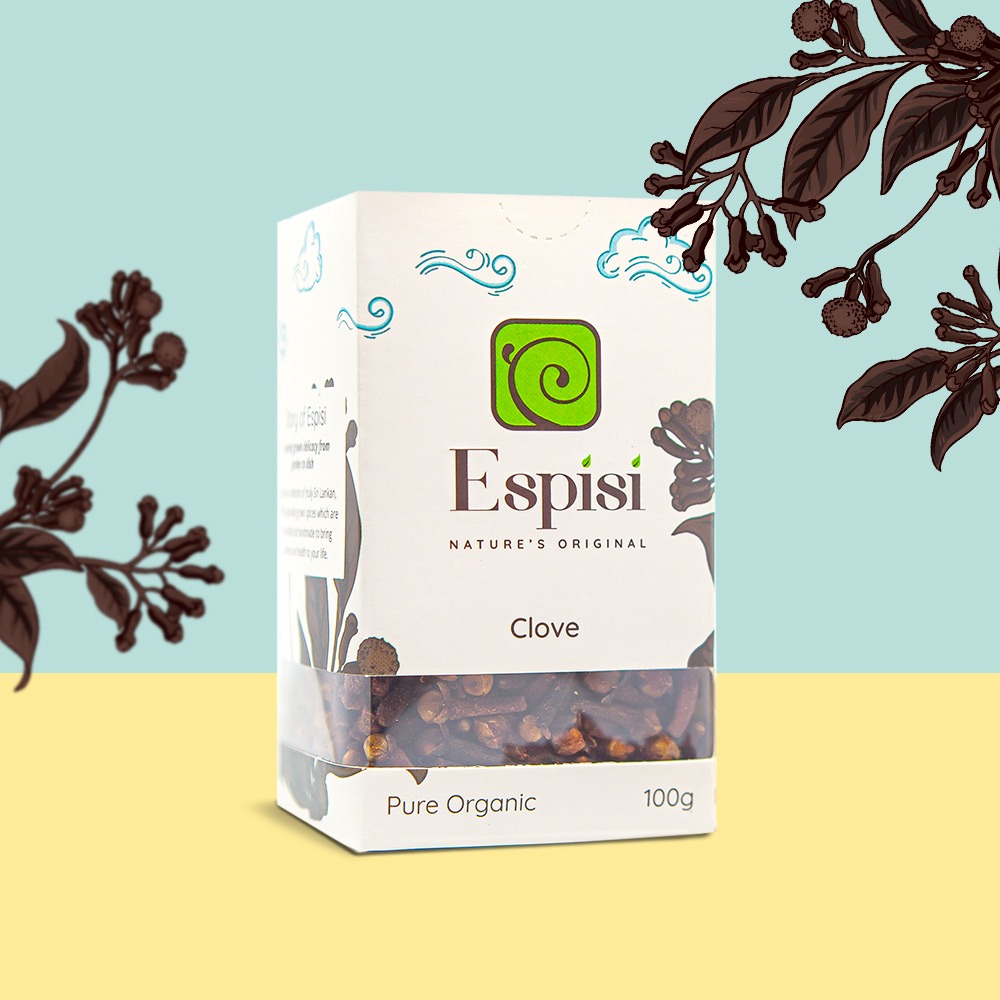
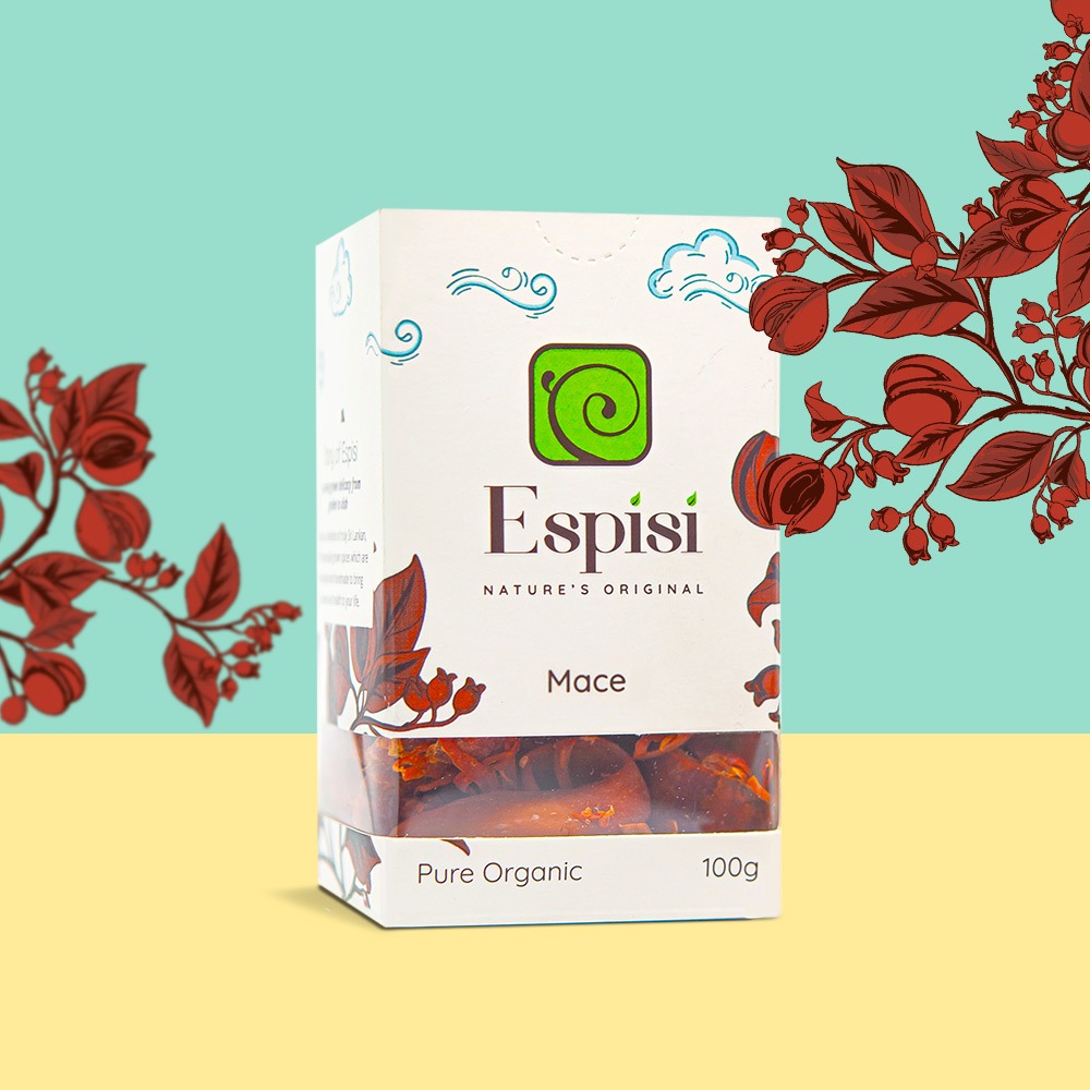
The challenge which was brought to us by the Espisi marketing team was a brand new high-end organic spice range which was to be introduced to the local & International markets. From the brand name to the packaging we were determined to establish a consistent brand image which echoes the Sri Lankan authenticity, export quality and the sustainable production of the spice range which is to compete with many other ordinary spice brands in the local supermarket shelves
How We Approached!
The key element of this campaign was to differentiate Espisi brand to make it a more attractive choice to the customers who are generally reluctant to pay a higher price to the spices which they use on a regular basis
What We Ignited!
Our team came up with the name “Espisi” after days of brainstorming to bring a Spanish undertone to the English word “spicy”. Earth tones and iconography were manipulated to create a logo which accentuate the natural element of the product. An easy to identify, clean packaging concept with an illustration of the spice plant was created with the high-end consumer in mind. We went the extra mile to put a see through section in the box to make it easy for consumers to compare the quality of the product. The brand statement “A purely grown delicacy from garden to dish” laid the foundation for the differentiating design and a holistic modern look in developing the packaging